
For the purposes of blood glucose trends research, a LinX brand CGM sensor was used. During the 15 days of wearing the CGM sensor, the user has a detailed display of the daily glucose level on a graph in the application. In that way, it is possible to read and analyze CGM charts.
In addition, there is an option to enter meal times, physical activity, and medications or insulin.
Instructions for setting up and using the LinX CGM sensor are available in this CGM sensor setup guide.
What Is an AGP Map and How to Interpret It
In addition to the daily display of glucose levels, the application offers us an overview of the AGP map. The AGP graph is a representation of the ambulatory glucose profile generated after 5 days by continuous glucose monitoring (CGM) sensor technology. This chart is important for tracking postprandial spikes and drops, variations, and general stability of the curve throughout the day.
Multi-Day Blood Glucose Curves: Identifying Patterns
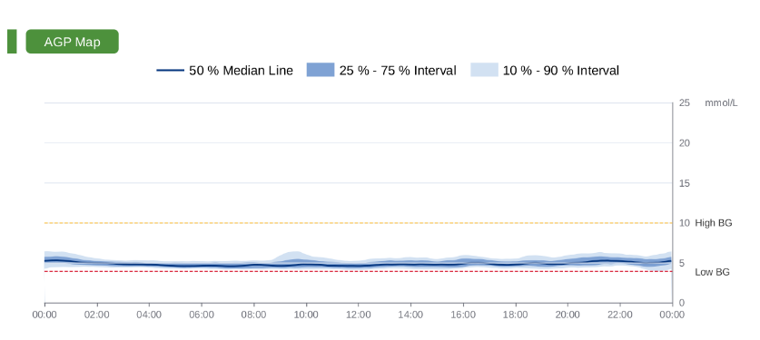
Shades of blue on the graph represent layers:
- Median (50%) – the dark blue color represents the mean value of glucose at each time point
- Blue cloud (25-75%) – interquartile range, where if the range is thin, there is not much variability
- Lighter blue cloud (10-90%) – represents a wider range where 80% of all glycemic values are found. If it is narrow, it is a sign of stable glucose regulation and excellent variability.
At the top and bottom of the AGP chart are horizontal lines:
- The dashed red line represents low glucose values up to 3.9 mmol/L
- The dashed orange line represents higher glucose values up to 10 mmol/L
- Light blue lines represent values above 10 mmol/L
Multi-Day Blood Glucose Curves: Identifying Patterns
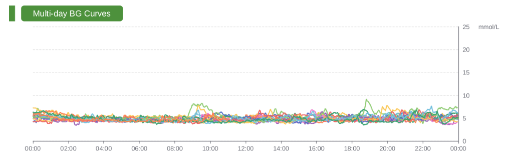
Multi-day BG Curves represent the actual variability of glucose levels during the wear period of the sensor. Each day is represented by a different color on the graph, so that the differences between the days can be clearly seen. This approach makes it possible to identify days that deviate from the usual values and to detect frequently recurring patterns.
The graph clearly displays postprandial spike increases, confirming that the profile follows the expected pattern of rises and declines.
Time Spent in Low and High Glucose Zones Explained
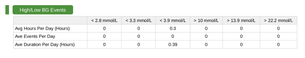
The High/Low BG Events table represents how much time is spent daily in low or high values and whether there are events that pop up.
Low glucose values (High BG):
- <2.8 mmol/L – very severe hypoglycemia
- <3.3 mmol/L – severe hypoglycemia
- <3.9 mmol/L – mild hypoglycemia
High glucose values (High BG):
- >10 mmol/L – mild hyperglycemia
- >13.9 mmol/L- severe hypoglycemia
- >22.2 mmol/L – extreme hyperglycemia
For a specific table example, the daily spending in mild hypoglycemia is 0.3 hours, i.e., about 18 minutes.
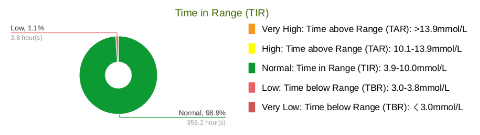
In addition to the tabular display, there is also an insight into the visual graphic representation. It represents the percentage of time spent in different glycemic zones. In this example, the rate of 1.1% in relation to normal values is insignificant.
Understanding how to read CGM charts helps identify blood glucose trends, improve daily control, and make informed lifestyle decisions based on real data.
👉 Next: How Diet Affects Blood Glucose Levels?
The goal of this personal glucose monitoring experiment is to understand long-term trends rather than single values. For a complete overview, visit the CGM data–based educational series.